I have not been adding changes to the website this week instead i've been thinking regarding the concept in general. i've added several images which i find interesting, and posting several shots from a show i visited in Museum of Contemporary Art Tokyo where they were having a children art exhibition. There were two works; one of which in the show and another I came across in museum shop which got my attention and they are in one way or another, have influenced the progress of the work.
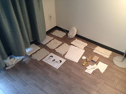
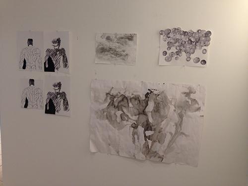
Before I go into the museum works, I have been trying out the different panel shapes for 'My name is Takeshi' drawings. I want the paper, as the base of the work to be shaped like manga panel which I feel usually is very well though of to inject more atmosphere to the narrative contained within each boxes. So, for the two sketches I have penned out, this week I managed to playa round with various shape of the panel, whichever gives more interesting shape and adds to the narrative of the work itself.
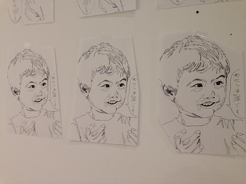
I am still not quite sure about the shape, maybe I will revisit this again next week.
But I plan the conversation box to be filled by children when the drawing has been completed.
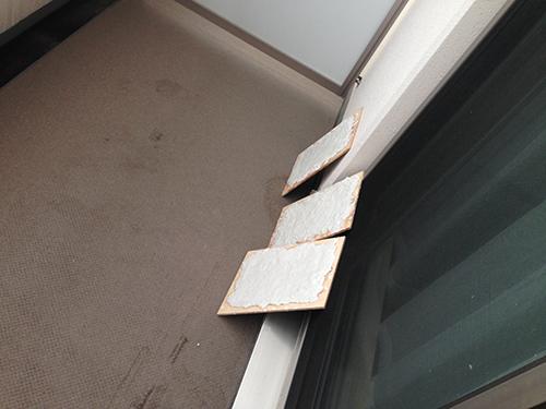
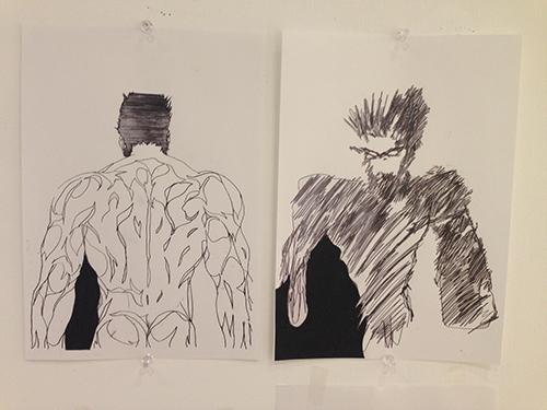
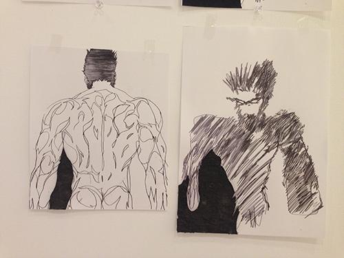
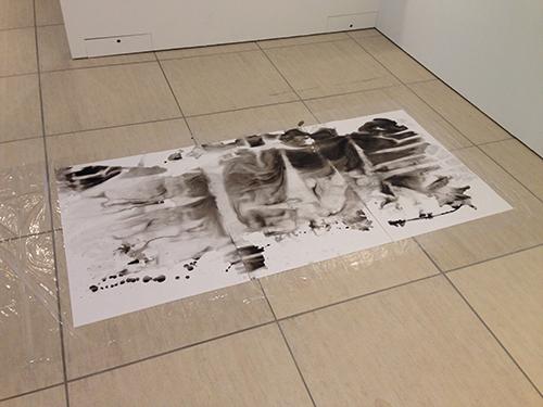
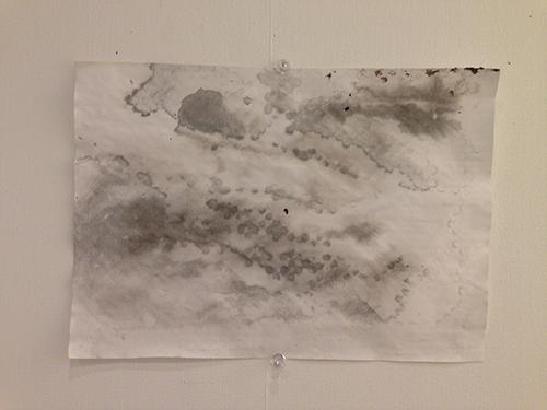
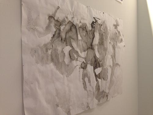
Next is the second drawing which will be a diptych. I have not tried the shading for the left panel yet but I want to add that blackened section. The blackened part follows the actual panel on the manga and it is intentionally served as aesthetic visual purpose. The diptych on the left below is a mixed media sketch using cut out crayon or oil pastel on paper. I prefer this result but not really sure about proceeding as the right panel will be crayon as well.
The right diptych is of cut out ink on hand-made paper. The color did not turn out to be as acidic as the crayon, and I would want the two blackened section to be really dark.
I will definitely revisit this again before making the actual diptych, planned to be around A2 size.
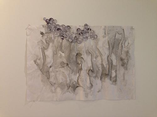
Apart from those two, I have also plyaed around with collages and ink on paper. Printing marks on them and making blocks of handmade paper. I plan these handmade paper to be used as base of painting I am developing for a side project.
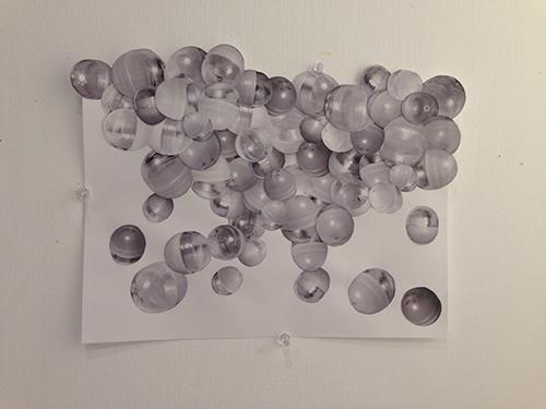
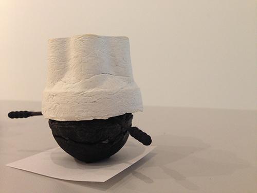
As might have bee noticed, there were images of gachapon, which I guess was not in existence til this week. Well, the idea came across as I have been hunting for gachapon machines, not for research but personal pleasure and collectible items which then got me an idea to actually use the round or spherical shape of the gachapon. Hence visually, it mimics the consistency of round objects found in the mangas Psyren and Gantz. But on the other hand, I feel gachapon is also an interesting addition to the project as a whole.
There is a child-like quality within the objects, as it involved certain degree of playfulness yet a risky experience. Chance becomes a prominent connotation which I feel might converse well with the theme of death and children which I have been trying to focus on. There is a sense of not knowing yet there is a full understanding of what to expect from a gachapon machine. There is anticipation and whenever there is one, excitement and disappointment and despair becomes potential answers. I feel it is quite an interesting connotation to be included in the project.
Collages of the repeated spherical gachapon balls also turn out to be quite pleasing, something which I enjoy in terms of making process and end result.
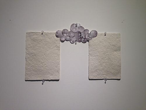
I have also attempted to duplicate the gachapon shells with tissue paper like I did for the pudding containers. However, they did not seem to work as well as I wanted them to be. Which then got me into further playing around and I got the idea of mascots. Here comes the development of the project concept.
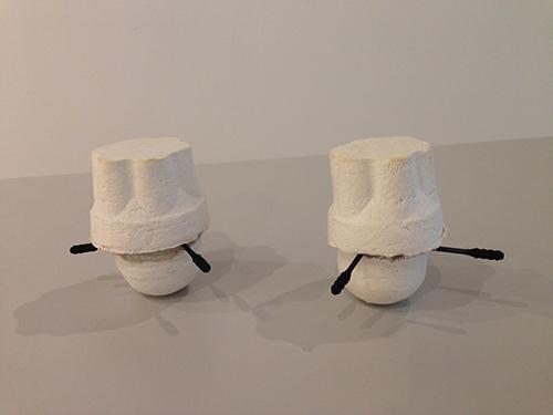
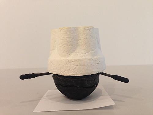
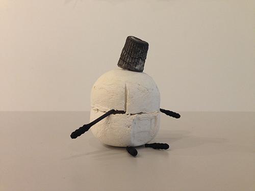
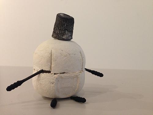
As I was playing around with the shape and arrangement of the so-called failed attempts at casting the gachapon, it came into realization that there is a possibility in creating a mascot. So I read up about mascots or yuru-kyara. From what I have gathered, mascots or characters are usually economic-oriented but created of the basis of cultural influences. Tourism and merchandising becomes a really important ideology but at the same time, mascots also able to not only promote but also introduce the places or context they are representing.
What I find fascinating is that, not only mascots and characters are eventually collectable (hence becomes something that I have been looking at as well) but also they are usually products of amateurs. Their forms are most of them time demi-humans, where animals, plants and even objects are personified in kawaii approach. They are meant to be friendly and adorable,
However, some are considered kimo-kawaii which means gross-cute. I find this interesting, as maybe there is possibility of having erotic-kawaii or masculine-kawaii form of mascot. Not necessarily represented by themselves but maybe in comparison to others, or the surroundings their images are placed in.
So the exploration resulted in my decision to create more replica of the gachapon and we'll see how the results be.
PS. Some information regarding mascots can be found here, here, here, here and here.
Oh one more thing, the mascots are also on the brink of depleting as the government does not seem to be very keen on having hundreds of them roaming around. I feel this scenario is very familiar to death and killing and it proposed an ever further specification of the question:
Why is it wrong to kill cute characters?
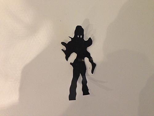
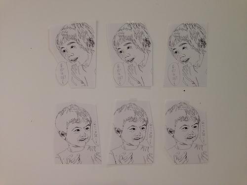
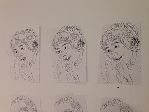
The works above are pretty much the Takeshi and Kaze's section of the project,to be realized as drawings. I have been thinking of the subsequent elements, and one of the idea is to have (with intention to use the manga visuals even further) to create cut outs of the characters in shadow version.
Relating back to the mascot, maybe there is a way to create mascots for Shinigami, or god of death.
Image on the left is a rough cut out figure of Ageha from Psyren.
The way the works have been developed, I feel that an installation will be appropriate at this point of time. I fancy the installation works of Makoto, Hiroko and Torajiro from the Aido family and Shinro Ohtake's Gacha-kei at the MOT. The various elements of the works seem to be not connected visually but somehow the space provides a journey, almost like a house's setting with children playground but of course from what I heard, the work is a commentary on Japanese education.
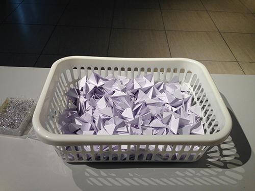
In relation to this interest, I have been folding (yeap, again) modular star shapes as an attempt to either visualize the elements of Kyle or Kusanagi. I ma not very sure what will be further processed of the paper objects.
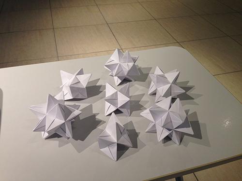
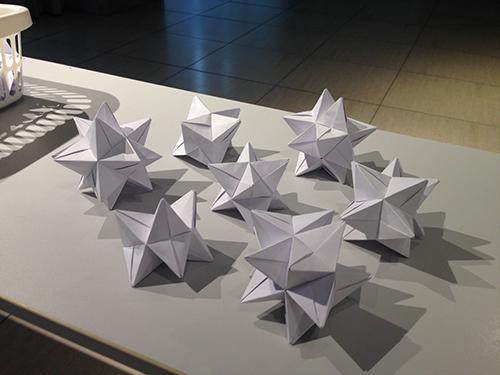
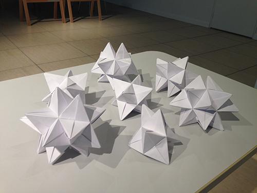
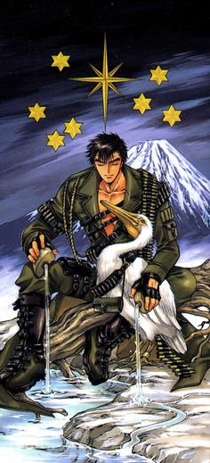
Kusanagi was given The Star card from Tarot and I feel this image is very performative. Hence if I were to add an active element to the final outcome, it might most probably be very referenced to this image.
Last but not least, I have moved most of the works to the studio. I have been working there for the whole day on Sunday and given the ample space, it has been productive to conclude week 2.
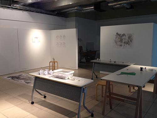
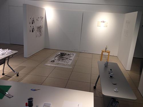
My room is pretty much more spacious now, leaving the paper tablet for the to dry. I would like to focus back on the website for next week, so I might not be producing much of drawings then.
:)